Updated: September, 25th 2025
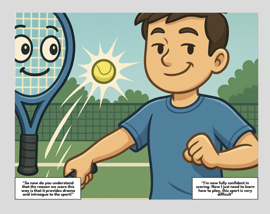
This comic was created to make the confusing nature of scoring in tennis more approachable for new players of all ages. I am a former top 10 junior for my age category and am currently a university level player. For the last 5 years now I have also been a tennis coach. The reason I chose this topic is because I find that many beginner and intermediate level players struggle with the scoring system.
A goal of mine through this project is to see if I can use this comic that I created with my students to make learning more fun and engaging.
The Process:
The Challenge(rs):
Beginner and intermediate level players often struggle to grasp the complexity and uniqueness of tennis scoring.
Context and audience:
The typical audience for this comic will be beginner players from adults who have recently developed an interest for the game to kids as young as four years old. I have seen in my years of coaching that new players of all ages struggle with the scoring system. The main need for these students (besides technical work) is a clear simple and engaging explanation of how tennis scoring works so they can either develop an interest in professional matches or feel more confident in their own. This comic format is especially suited for kids, since it allows for visuals, humour and a linear explanation of the rules.
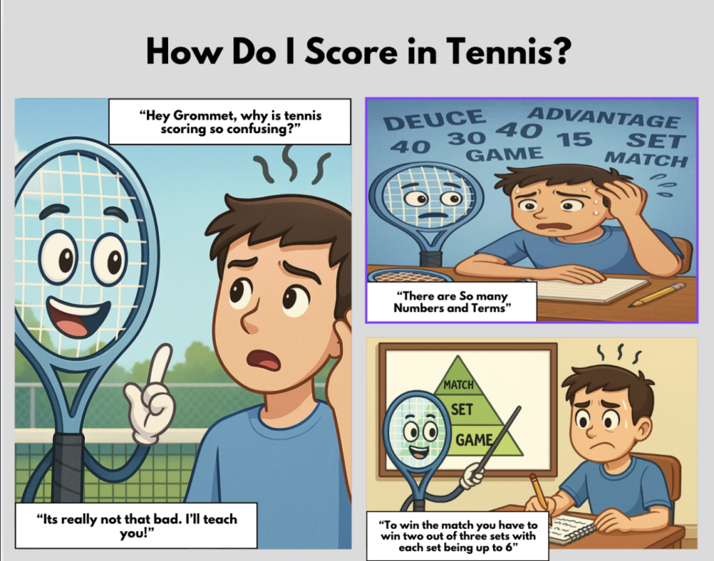
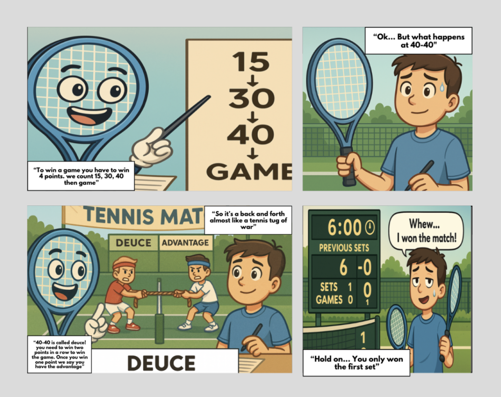
In more extreme cases, the audience could include people without a sports background or those who find sequences and rules intimidating. For these learners, the comic must provide both factual accuracy and relatability. That is why the main character is often depicted as overwhelmed or confused, much like those who may be reading the comic. Furthermore, The friendly and welcoming guide as well as the humour (eg. tug of war gag for deuce) reduces learning related stress and makes tennis scoring more approachable.
Demographically, the audience of this comic is broad spanning from youth athletes, recreational players and even sports fans who like watching tennis but don’t understand the rules. Although this comic is targeted to a wide range of people, I believe this form of learning best caters to young kids learning the game. Psychographically, the learners are motivated by curiosity and potentially have a desire to further understand the sport (to potentially fit in with a social group) or by improvement as they want to have a deeper understanding of scoring to better apply tactics. Behaviourally, these are hands-on learners who benefit from repetition, analogies, and seeing concepts applied in real-world game contexts.
Overall, the comic addresses practical and emotional needs. It simplifies a confusing system, reassures learners that feeling of confusion and overwhelmingness are ok, and motivates them to develop a deeper understanding and engagement with the sport. By the end of reading this comic the reader should feel confident in the rules of scoring, while also understanding that full mastery of scoring and the sport in general requires more application. This balance of knowledge and humor makes the comic appealing to both beginners and casual tennis fans alike, satisfying both its educational and entertainment objectives.
POV statement:
A beginner tennis player who feels overwhelmed by tennis’s confusing scoring system needs a simple, engaging and accessible explanation so that they can confidently follow and play in matches, while also recognizing that learning to play the sport itself will take further effort.
Learning objectives:
Primary objectives:
- Learners will be able to explain the basic scoring system (love, 15, 30, 40 and game).
- Learners will be able to describe the rules of deuce and advantage (especially the recurring concept that you have to win by two points).
- Learners will be able to differentiate between games, sets and matches as well as understanding how many sets are required to win a match.
- Learners will be able to recognize how tiebreakers work and why they are used.
Sub-objectives:
- learners will understand why tennis uses a non linear scoring system.
- Learners will be able to identify when scoring resets.
- Learners will begin to understand the sequence of serving rules especially in tiebreaks.
Secret/Implicit objectives:
- Promoting sports literacy.
- Creating a greater interest/appreciation for the the sport, by showing there is a human side to learning tennis.
- Model that feelings like confusion are ok to have.
PLANNING:
IDEATION:
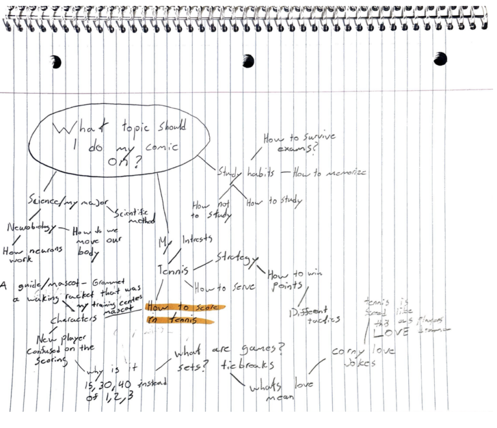
To begin my brainstorming, I created a mind map (above image) of any ideas surrounding my central question “what topic should I do my comic on?” From here I engaged with topics surrounding my major (neurobiology), study habits and other ideas around tennis. This helped me look at all my options while still surrounding myself with topics that interest me.
My most promising prototypes:
- A comic where a confused beginner learns the tennis scoring system step by step, with guidance from the racquet mascot.
- A gag-based explanation of unusual terms like “love,” “deuce,” and “advantage,” using visuals
Storyboard/Script Draft:
Page 1:
- Panel 1: A confused beginner tennis player stands on a court scratching his head. Dialogue: “Why does tennis scoring make no sense?”
- Panel 2: The racquet mascot appears cheerfully. Dialogue: “Don’t worry — I’ll walk you through it!”
- Panel 3: Scoreboard graphic: Love → 15 → 30 → 40 → Game. Mascot explains: “It’s just four points to win a game, but we use special names.”
Page 2:
- Panel 1: Player looks more confused, notebook in hand. Dialogue: “Wait… why not 1, 2, 3, 4?” Mascot shrugs: “Tradition!”
- Panel 2: Split panel: Score shows 40–40. Mascot says: “That’s called deuce!” Player sighs: “Of course it is…”
- Panel 3: Visual gag: Two players in tug-of-war labeled “Advantage” vs. “Deuce.” Caption: “You must win by two points in a row.”
Page 3:
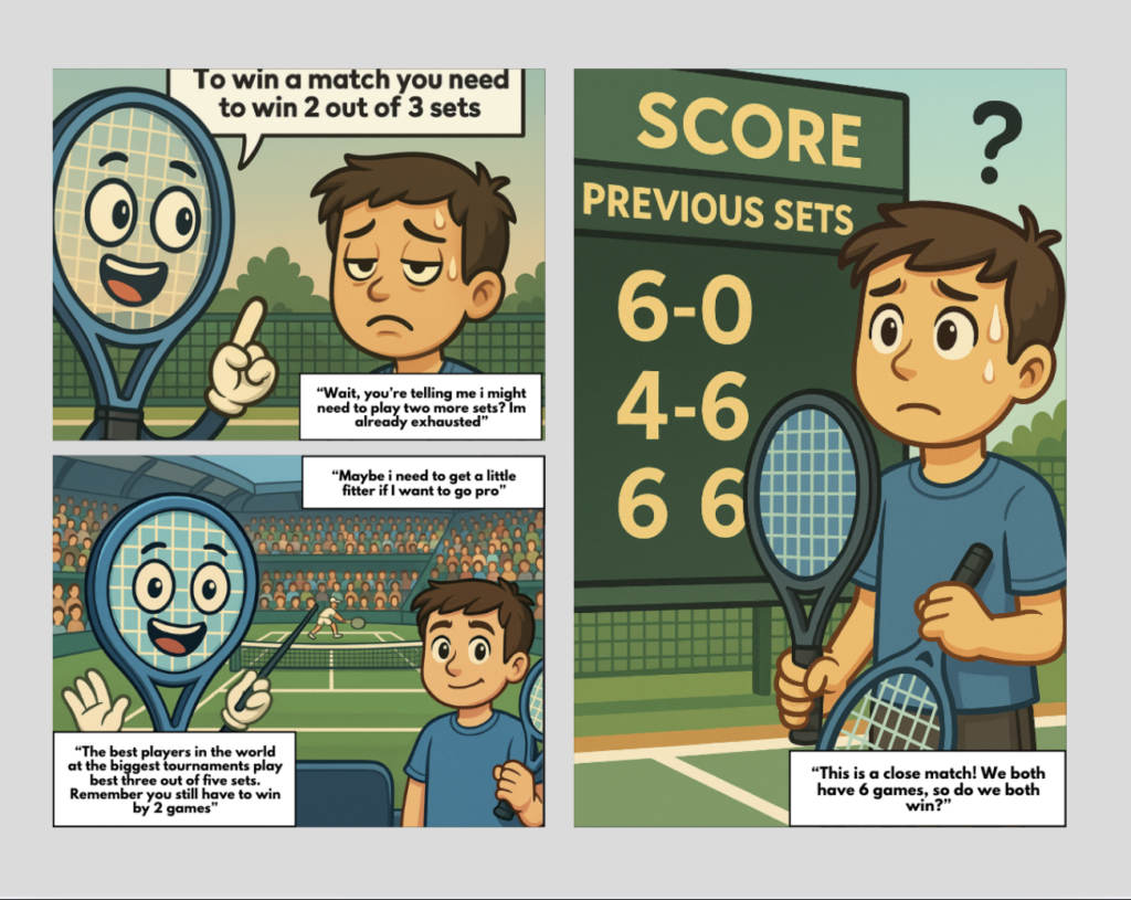
- Panel 1: Mascot points to a pyramid: bottom = Game, middle = Set, top = Match. Dialogue: “You need 6 games to win a set, and 2 sets to win the match!”
- Panel 2: Player collapses in exhaustion after winning one set. Dialogue: “Whew, I’m done!” Mascot replies: “Nope, just the beginning.”
- Panel 3: Scoreboard shows 6–6. Player confused again: “So now what?” Mascot: “Time for a tiebreaker!”
Page 4:
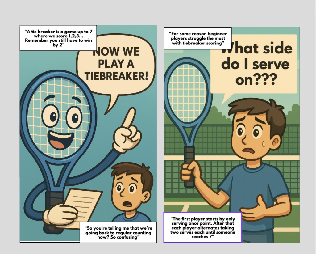
- Panel 1: Mascot explains tiebreak rules: “We count 1, 2, 3 up to 7 — but you still must win by 2.”
- Panel 2: Player at baseline, thought bubble: “Which side do I serve on???”
- Panel 3 (Final): Player looks proud holding a racket. Dialogue: “I finally get the scoring!” Ball flies wildly out of bounds. Mascot: “Now let’s work on your serve…”
Principles applied:
While designing my comic, I applied Mayers educational multimedia principles to ensure that the explanation of tennis scoring was not only engaging but also instructionally effective. The Multimedia principle is applied heavily in this comic by combining visuals and short text explanations. This is seen through the usages of analogies like tug of war or the scoring pyramid. The coherence principle is also used by only focusing on key rules (games, sets, matches, deuce and tiebreaks) giving the reader enough information to have a game of their own and leaving out extra unnecessary details. Finally, the personalization principle is seen through the usage of a friendly guide like character to prompt dialogue and make the learning less intimidating.
Prototype:
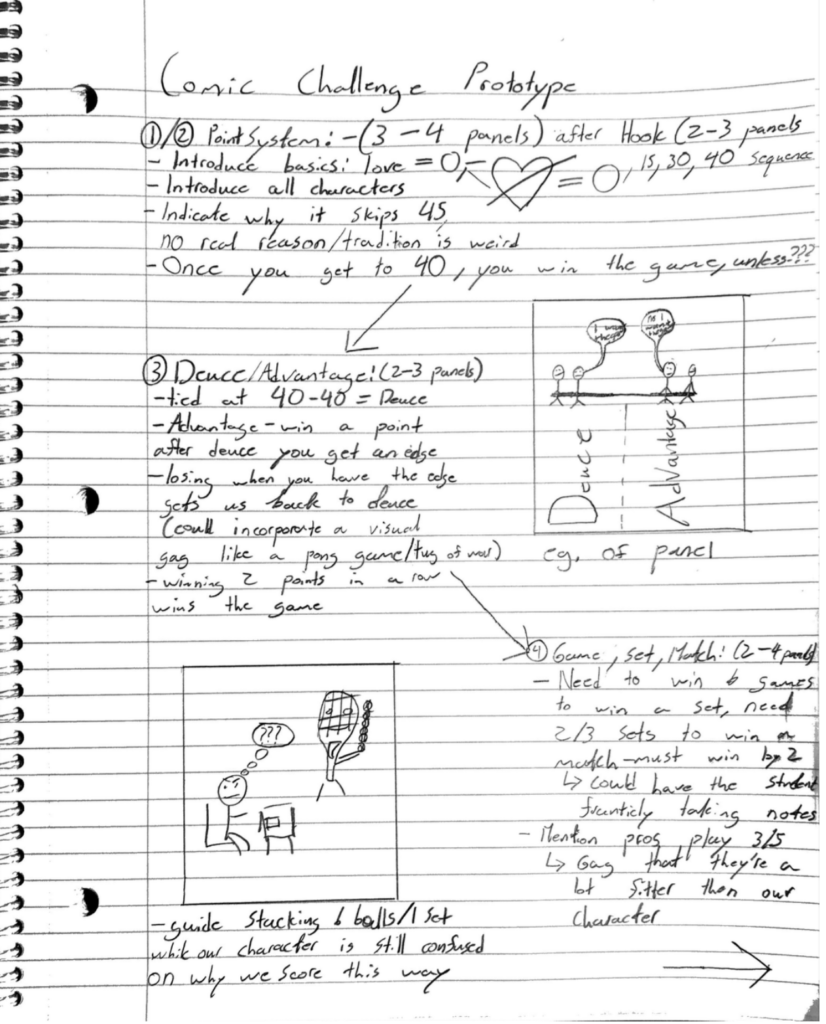
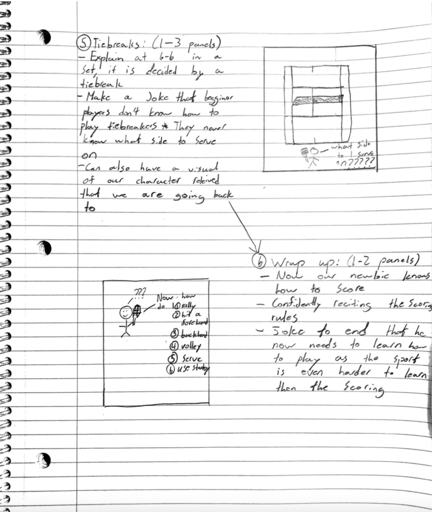
Peer feedback:
The peer feedback I received on my prototype was very positives, with my peers noticing both my passion for this topic as well as my knowledge and ability to create a product that simplifies a confusing topic. They felt like the step-by-step explanations along with humour and visuals was well suited to explaining tennis scoring.
Two main suggestions stood out to me. The first was to lean more heavily into the humour especially through the usage of analogies as readers may understand these concepts better. The second suggestion was to increase the presence of the guide character to make the comic feel like more of a conversation between a learner and a teacher (mascot).
Reflection:
One element of my prototype that worked well was the overall idea to use humourous visuals and situations to explain the confusing scoring rules of tennis. Peers noticed that the step-by-step structure as well as the usage of a mascot guide with a friendly tone made the comic highly approachable.I believe that I executed the idea of pairing a confused learner with a knowledgeable guide. This allows readers to both identify with the character while still receiving clear instruction. This tightly aligns with Mayer’s Multimedia Principles, which highlights how learning improves when text and visuals are combined to support understanding (Mayer, 2009).
I felt like I received very useful feedback from my peers. They noted that my initial prototype explained the rules accurately, they especially enjoyed the moments of humour and suggested to lean further into that aspect of the comic to keep sustained engagement. The second suggestion that I should increase the amount of character-character dialogue between the mascot and learner helped me reframe the comic as more of a casual conversation as opposed to a lecture. If I were to refine further, I would want to add an interactive factor such as discussion or quiz prompts within the panels to prompt constructive dialogue between educators and students. This would align with Clark and Mayers segmenting principle. This principle emphasizes breaking material into chunks and letting learners process information actively (Clark & Mayer, 2016).
I believe that the main strength of this educational medium is that comics are highly accessible and appealing to a large range of demographics. They are highly effective at conveying ideas through visuals, storytelling and humour which in turn lowers barriers to learning. However, Comics do have their limitations. Comics are static images making them unable to provide immediate feedback compared to interactive multimedia options. This limitation means comics work best as an introduction or explanation to a topic, not as a stand alone teaching method.
Overall this project, showed me the importance of effective multimedia that balances clarity, engagement and personal connection. What worked well was the approachable format, use of humour and the conversational guide. In the future, (as I have to create some forms of media as a coach) I would like to improve on the degree of interactivity. By using what we have learned about Mayer’s design principles, the final product is substantially improved in comparison to my prototype. This particularly demonstrates how humour and storytelling can make complex systems feel approachable and understandable.
References:
Clark, R. C., & Mayer, R. E. (2016). E-learning and the science of instruction: Proven guidelines for consumers and designers of multimedia learning (4th ed.). Wiley.
Mayer, R. E. (2009). Multimedia learning (2nd ed.). Cambridge University Press.
Final Comic:
